- FEATURED
- ALL PROJECTS
- + ARCHIVE
- + CLIENT


- A&E
- ALFONZO RIVAS
- ANIMAL PLANET
- BANCO CANARIAS
- BDA & PROMAX
- CADA
- CANAL 9
- CANTV
- CINEMAX
- DIE GESTALTEN
- DISCOVERY CHANNEL
- DISCOVERY H&H
- DISCOVERY ID
- DISCOVERY KIDS
- DISCOVERY NETWORKS
- DISCOVERY T&A
- E! ENTERTAINMENT
- FOX LIFE
- FSC / WWF
- GRUPO UNO
- H. CAPRILES RADONSKI
- HBO
- HUMANUM
- INFINIA
- KIT-CHE-N
- LIFETIME
- MGM
- NEORIS
- NESTLE
- NICK
- NVIDIA
- OVO
- OWN
- PLAZA SESAMO
- POLAR
- RODRIGO GONSALVES
- SKY NETWORKS
- SONY
- STRUENDO
- TELEMUNDO
- TLC
- TOTUMA
- TOTUMA LAB
- UNIVERSAL CHANNEL
- VENENO INC.
- VISA
- WARNER CHANNEL
- + CATEGORY
- AWARDS
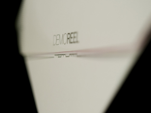
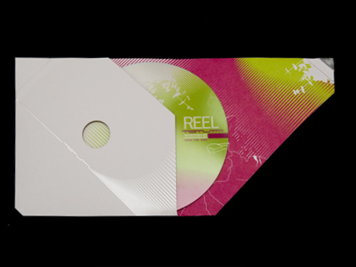
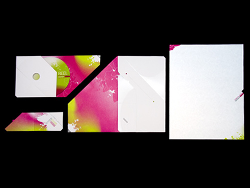
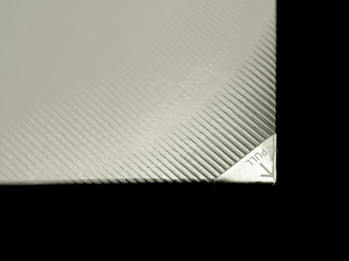
TOTUMA.STATIONARY
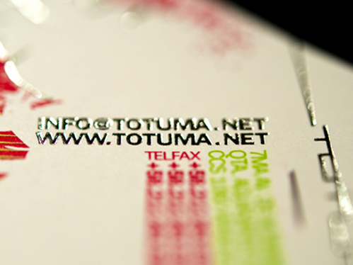
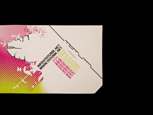
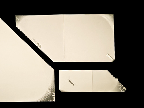
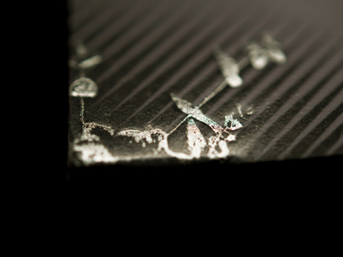
To build upon our own identity has always been a challenge. Our stationery always has to be a statement, a design experiment on itself; we then decided to take our identity beyond the boundaries of latinamerican regionalism, being less obvious on the use of local elements, rather inspiring ourselves in art currents such as cinetism and the exhuberant organic nature that determines our surroundings. A predominantly smooth, streamlined and minimal surface opens to discover a rich and colorful content full of detail, in the same way the totuma’s fruit hard shell surrounds its vital content. We transformed the common stationery utilities into useful and aesthetic objects, for example, by projecting the use of a letter envelope into a folder that would also carry digital media, sealing itself by the same material’s tensions, rather than by the use of some adhesive. The use of nontraditional details such as metallic foil and reserved spaces by special inks and barnishes play together to generate subtle texture in greeting cards and envelopes, generating an array of pieces that transcend the bidimensional plane to become a collection of design objects.
2008.Bda latin america
Prize: Silver
Category: Stationery
Project: Stationary
Client: Totuma
Submitted by: Totuma comunication and design
Creative Direction
Hubert Reinfeld
Vladimir Mihalkov
Cristina Briceño
Graphic Design
Johana Ertl
Dario Utreras

